Delivery
How a computer works
Karllie's programme was structured so that each part is done in one term. In term 1 students learnt the basics about how a computer works – hardware and software, primary and secondary memory and operating systems. They were given the opportunity to be assessed for Unit Standard 2780 to demonstrate generic computing knowledge.
After learning file management, students created a logical file structure, using Microsoft Windows Explorer, which they could submit for assessment for Unit Standard 2781.
As well as learning the practical aspects of working with computers, students also had to consider computer ethics – privacy, copyright, piracy and organisation confidentiality. Karllie gave students a worksheet with a variety of scenarios, and asked them to consider the implications for data safety in each case.
The term concluded with a section in which students were introduced to correct use of a computer in terms of health and safety issues, such as ergonomics
Graphics
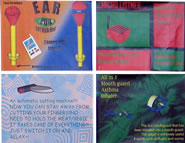
Students were asked to create the 'ultimate' technology gadget for the 21st century and promote it to a target audience. They began term 2 practising free-hand sketching techniques and drawing shapes using the computer.
The class learnt the basic features of Adobe Photoshop and worked through a tutorial on the program. Karllie then introduced them to the concepts of vector and bitmap imagery – students explored the internet to find and document the differences between the two formats and when they should be used for making an image. Karllie followed this by teaching the basic features of Macromedia Freehand.
After making an initial plan, the students researched different types of gadgets – such as the iPod, mobile phones, Playstation etc – to identify the requirements for a well-designed gadget. Karllie asked students to concentrate on two components – Technological Products and Characteristics of Outcome – and ask questions such as: What is it made of? Why is it made of that? How does it work with the other materials? Why was it shaped like that? How was it shaped like that?
While doing their research the class also studied advertisements, looking at the imagery and text used to market today's gadgets.
Students discussed their ideas with stakeholders and then developed concept sketches, which they modelled using SketchUp and made into a small movie. They also displayed their modelled concept to the class, where they were expected to explain the gadget's functions and purpose and evaluate it and justify its fitness for purpose.
The class discussed attention-catching advertising/promotion and then individually documented examples of good and bad design practices. Karllie talked about design principles such as contrast, repetition, alignment and proximity (CRAP), balance and space, and asked students to find examples on the internet of how well (or not) these principles had been followed.
Students developed their own concept ideas for promoting their gadgets, sketching them on paper and choosing one of these to create on the computer. They finished this work with evaluation of their promotion, to justify its fitness for purpose, and evaluation of their planning.
Karllie Clifton:
"Students have to promote their gadget to a target audience; this brings in the idea that they can transfer this knowledge of products and outcomes into an ICT context, because they're making their own technological outcome – the poster. Having to think about materials, size, resolution and all those sorts of thing helps them make that connection – that it doesn't matter whether it's a bottle, a poster or their gadget, they've all got these properties."
Web design
In term 3 students developed, created and implemented a website. Preparatory work included researching and evaluating some existing websites. Topics for the students' individual sites had to be educational so, after consulting with their stakeholders and clarifying the purpose of their site, students researched their issue to ensure they had sufficient knowledge/resources for the content of their website.
When developing their concept, students created a site map which identified all page names, titles, navigation and content, and created at least two of their original concepts for their page layouts. They were expected to take/document screen shots, as evidence throughout their development, and show that they had tested their website.
Karllie entered her class into the TVNZ/Net Guide Schools Web Challenge noting that it's a bonus if they do well (of the top 50 web designers in 2007, six of her students were recognised in their categories), but the overall focus of the unit was designing a website. "The Challenge provides practice in uploading work onto another server and transferring files from one server to another. It also involves students fully comprehending that the files are sitting here at school, then they're sitting in Auckland, and they've got to load them again, which is quite a big concept for them to get their heads around at that level. That's why we do it, so students learn about how a website actually works in the real world as opposed to working on the computer in front of them."
Programming
The class was given a basic software project in which they had to design a game. Students first analysed some simple games before setting to work on their own development. Karllie taught them programming using Qbasic.
In their initial brief they had to consider resources, stakeholders (including parental acceptance of a game!), and their own knowledge of gaming. The game had to be original, interactive and fun for the player.


